Perma.cc
A web service used by courts, scholars, and journals to create permanent records of the web sources they cite.
The Project
Perma’s core service is simple: input a URL and receive an archive in return. Your archive is stored at an academic or public library and is available forever. No more 404s in citations.
I worked on Perma at the Harvard Library Innovation Lab from 2013 to 2017, playing the roles of Interaction Designer, Full-Stack Developer, and Product Designer. This case study walks through the process I led to define the interface that displays web archives — shipped in 2017.
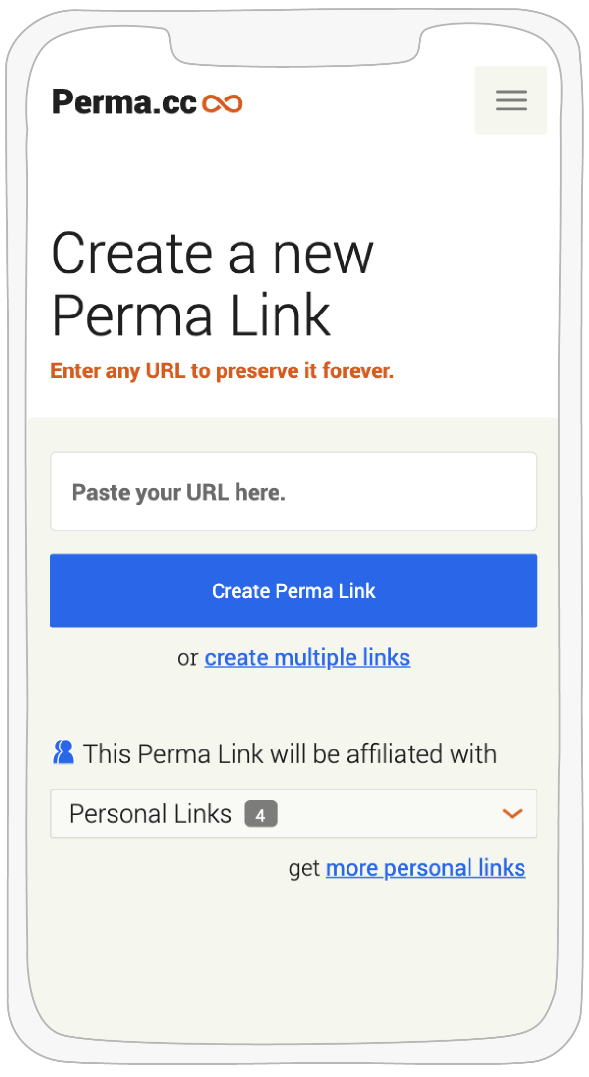
Enter any URL and Perma generates a web archive for you.
The Problem
Presenting an archive of a webpage is a fine balance. You want to give the archive replay the maximum amount of screen real estate — but you also need to make it clear that what’s being displayed is a snapshot of someone else’s site, not original Perma content.
Find the fine line.
Perma does not display original content.
The Solution
Users come to a Perma link to see the archive — that’s the job. We wanted to add only the most necessary labels and chrome around it.
The interface we shipped uses a thin blue header carrying two dropdown panels: one for admin controls, one for archive metadata. Here’s a real example — a Wikipedia page I captured. First-time users could quickly read the pattern and navigate it, and it met our engineering requirements of being efficient across devices and viewport sizes.
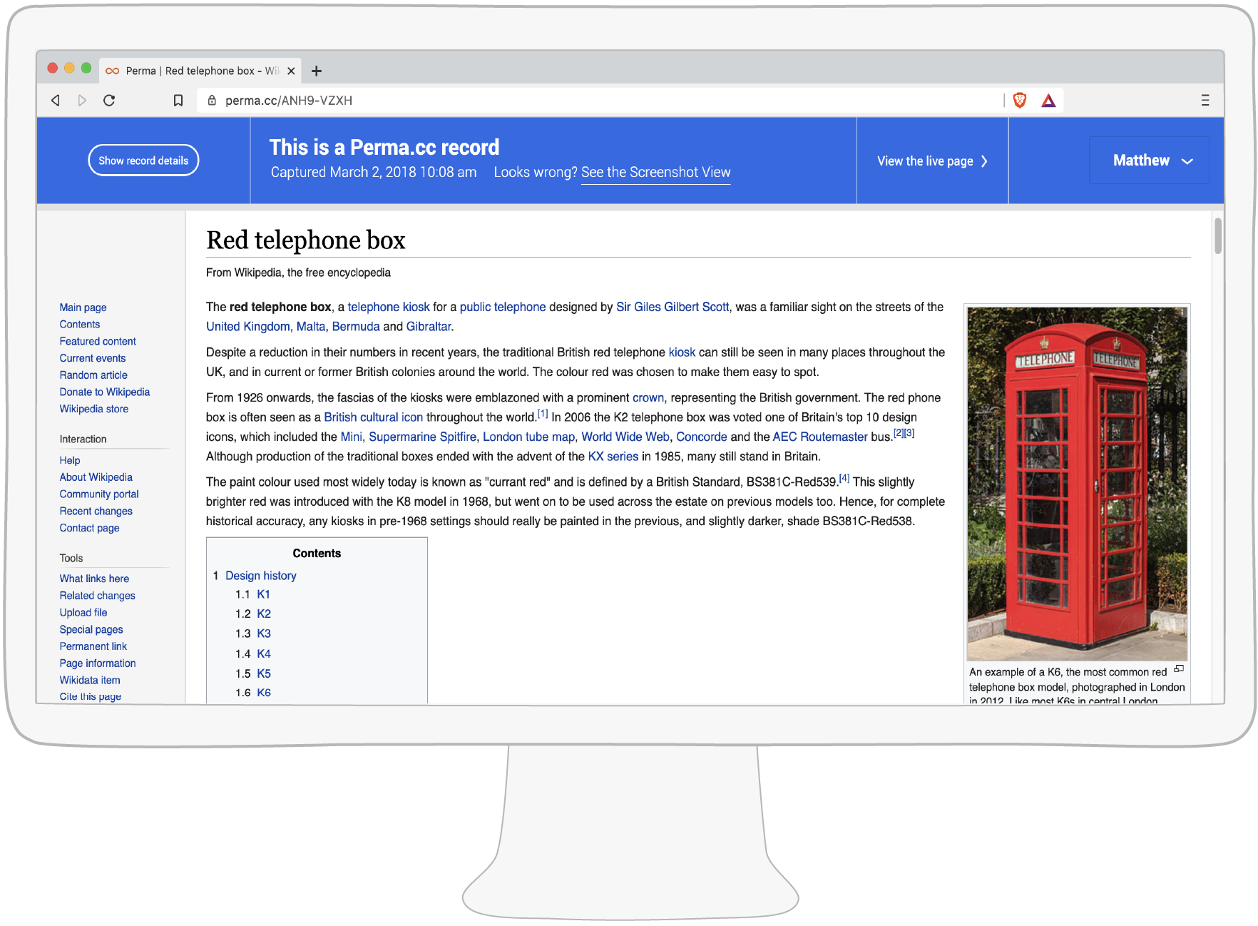
An archive of a Wikipedia page displayed with Perma’s blue header.
The Process
The work above came out of an iterative design process I’ve used for many years on both software and hardware projects. The core idea: turn up the variance early, then cull. Generate a large volume of wild ideas before narrowing the focus, so you don’t get stuck on the first plausible-looking answer.
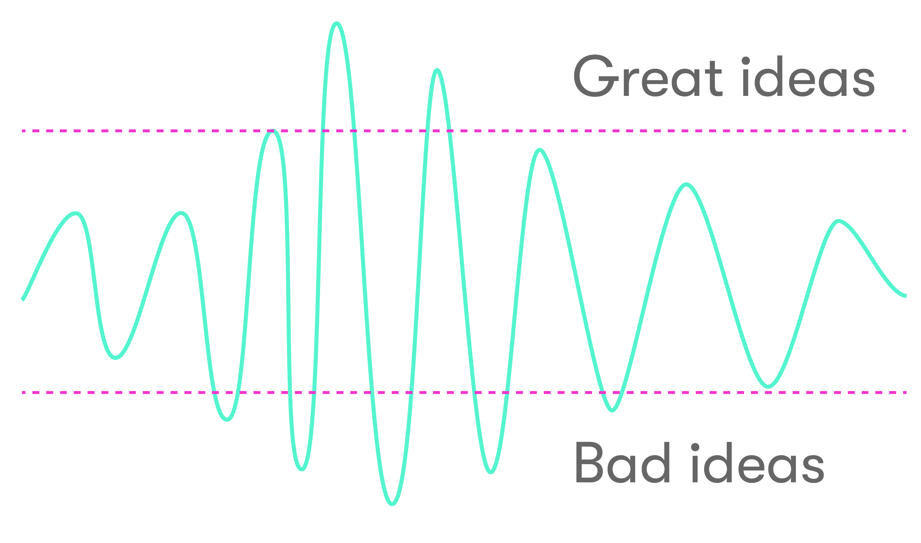
Avoid local maxima by dialing up the variance.
Step One — Generate
Output: ~50 note cards.
Gather two or three teammates around a table. Pitch the problem briefly. Run a workshop of lightning rounds to produce wildly different ideas and directions.
You’ll generate mostly bad ideas with a few potential gems mixed in. Keep the mood light and freewheelin’ — closer to improv comedy than design crit. Suspend disbelief.
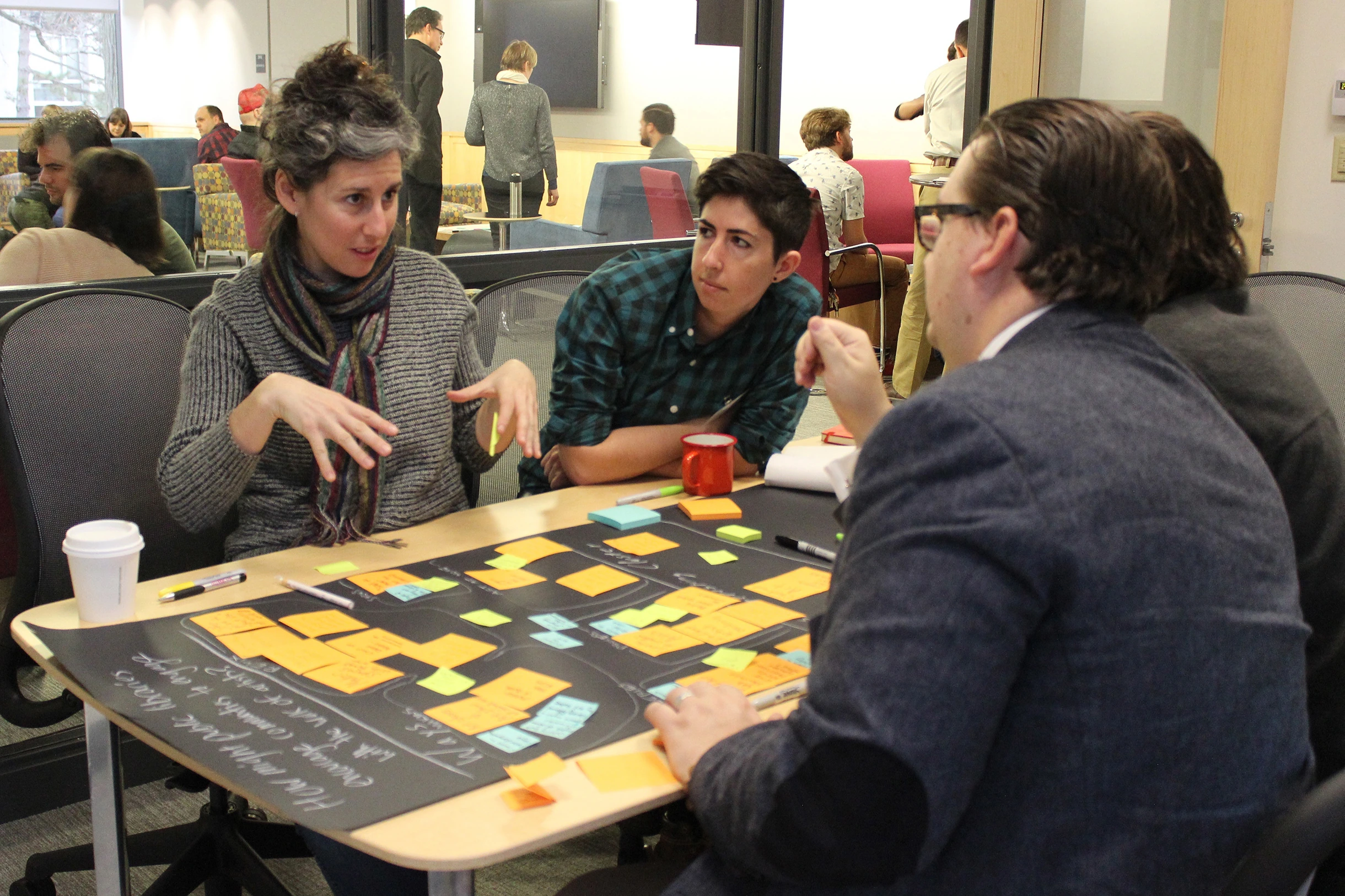
Generating wild interface ideas with colleagues during a design session.
Step Two — Group
Output: a wall of grouped cards.
Nominate a participant from step one. With group guidance, they tape or pin cards to a surface, looking for clusters that share energy.
Keep adding and expanding here. Don’t discuss technical implementation yet — it’ll prematurely collapse the search space.
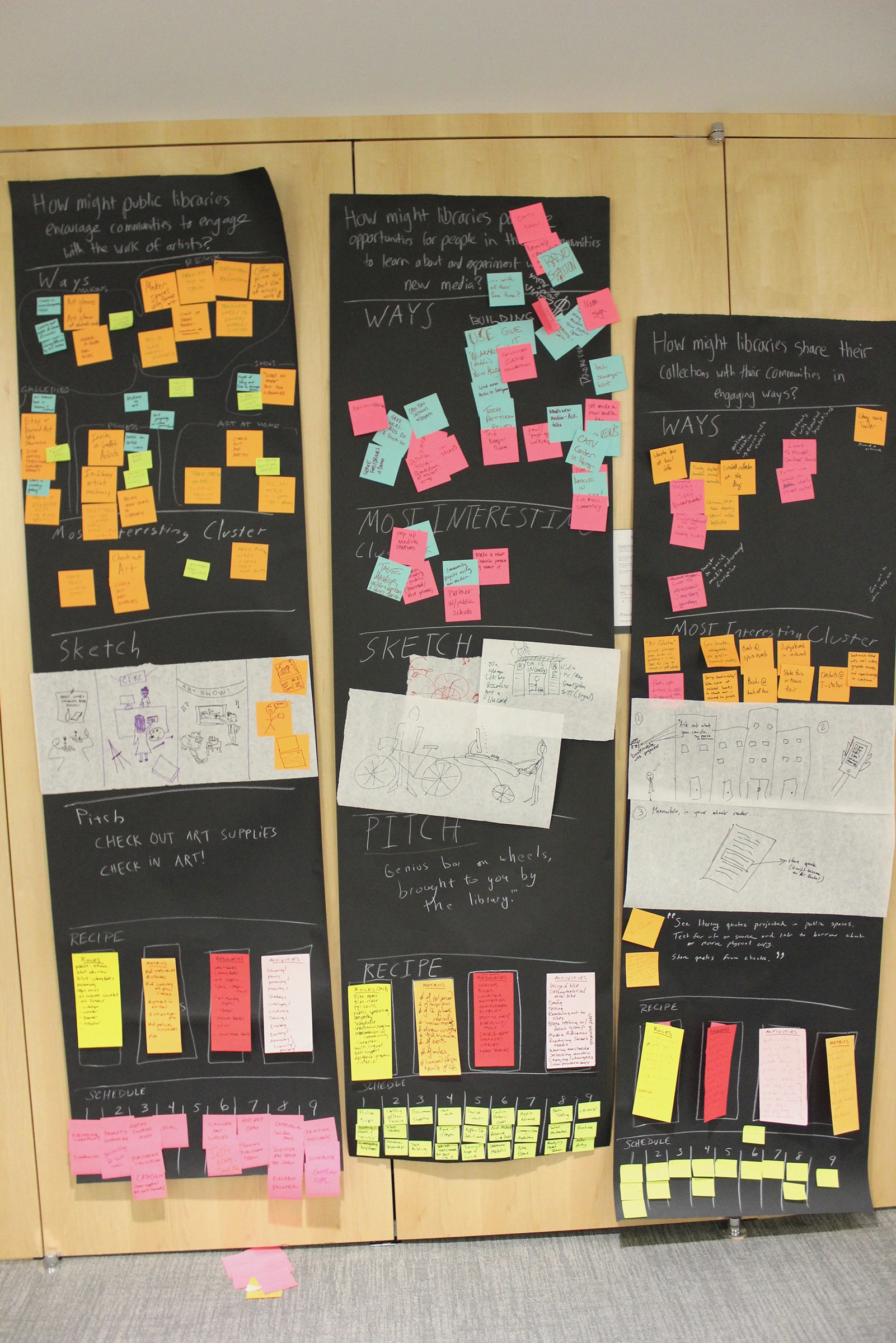
Loads of cards organized on paper.
Step Three — Sketch
Output: a few sets of paper wireframes.
Now we narrow. As the Interaction Designer, I produce wireframes from the strongest groupings, with influence from prior art and known patterns.
Wireframes can zoom in (one menu) or out (a whole flow). Pencil and paper, deliberately — the low fidelity signals to everyone that these are still gestures, not decisions.
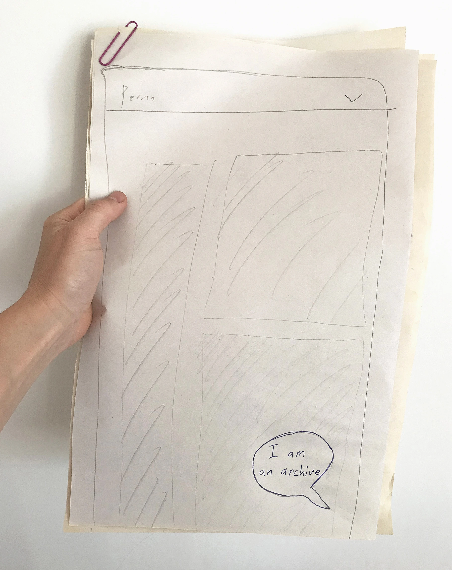
Wireframes showing a persistent chat-bot interface on top of the archive replay.
Pencil and paper. They’re just a gesture.
Step Four — Refine
Output: one or two medium-fidelity wireframes.
We should be zeroing in on a couple of promising paths — ideas worth refining with power users, testers, and internal team members who understand the customer base.
In this case, we arrived with two candidate interfaces and needed help choosing. We gathered a handful of early adopters and walked through interactions using medium-fidelity wireframes. The exercise stress-tested the directions and aligned the broader team on a narrowing set of flows.
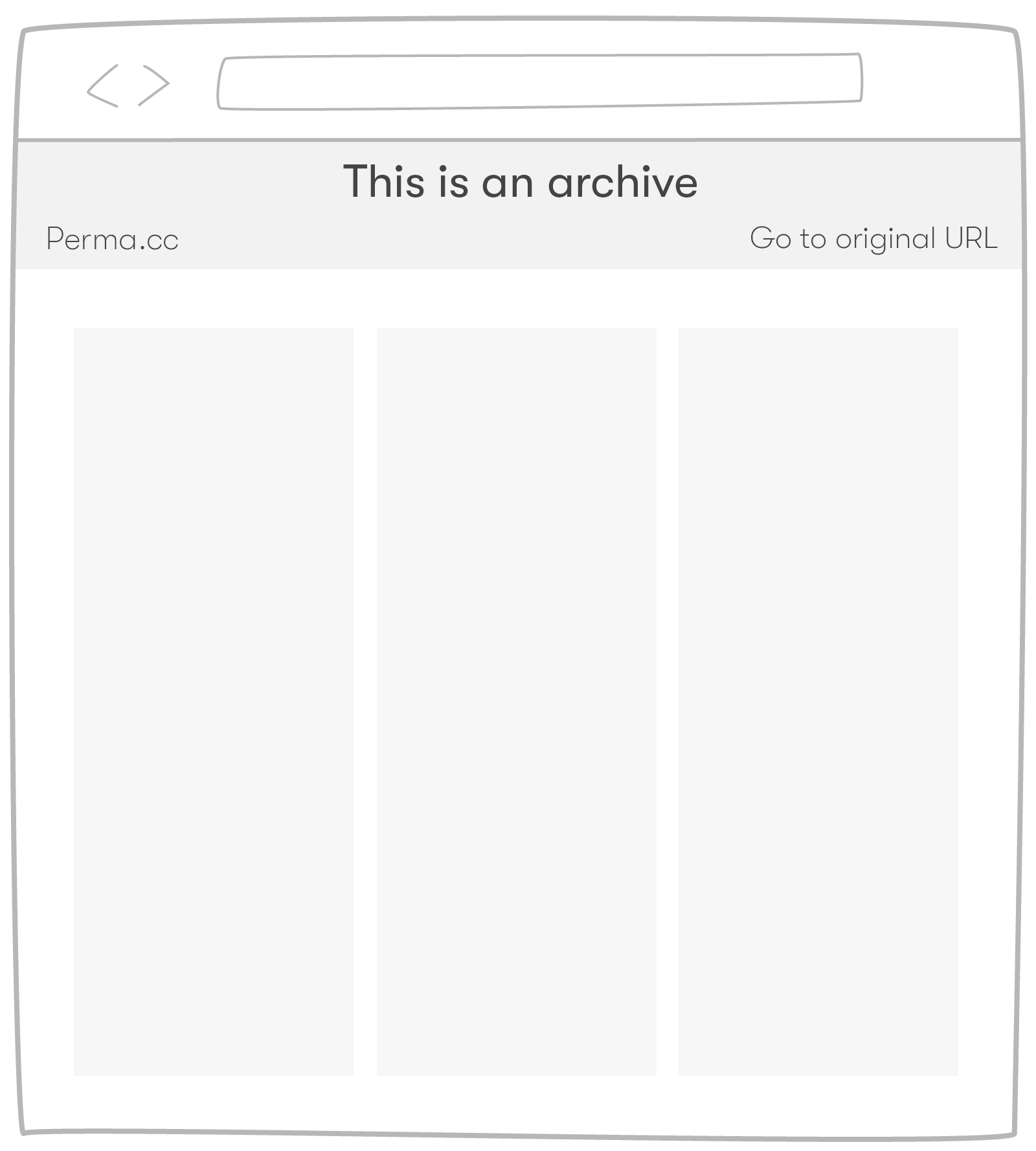
The thin-header approach — the one we shipped.
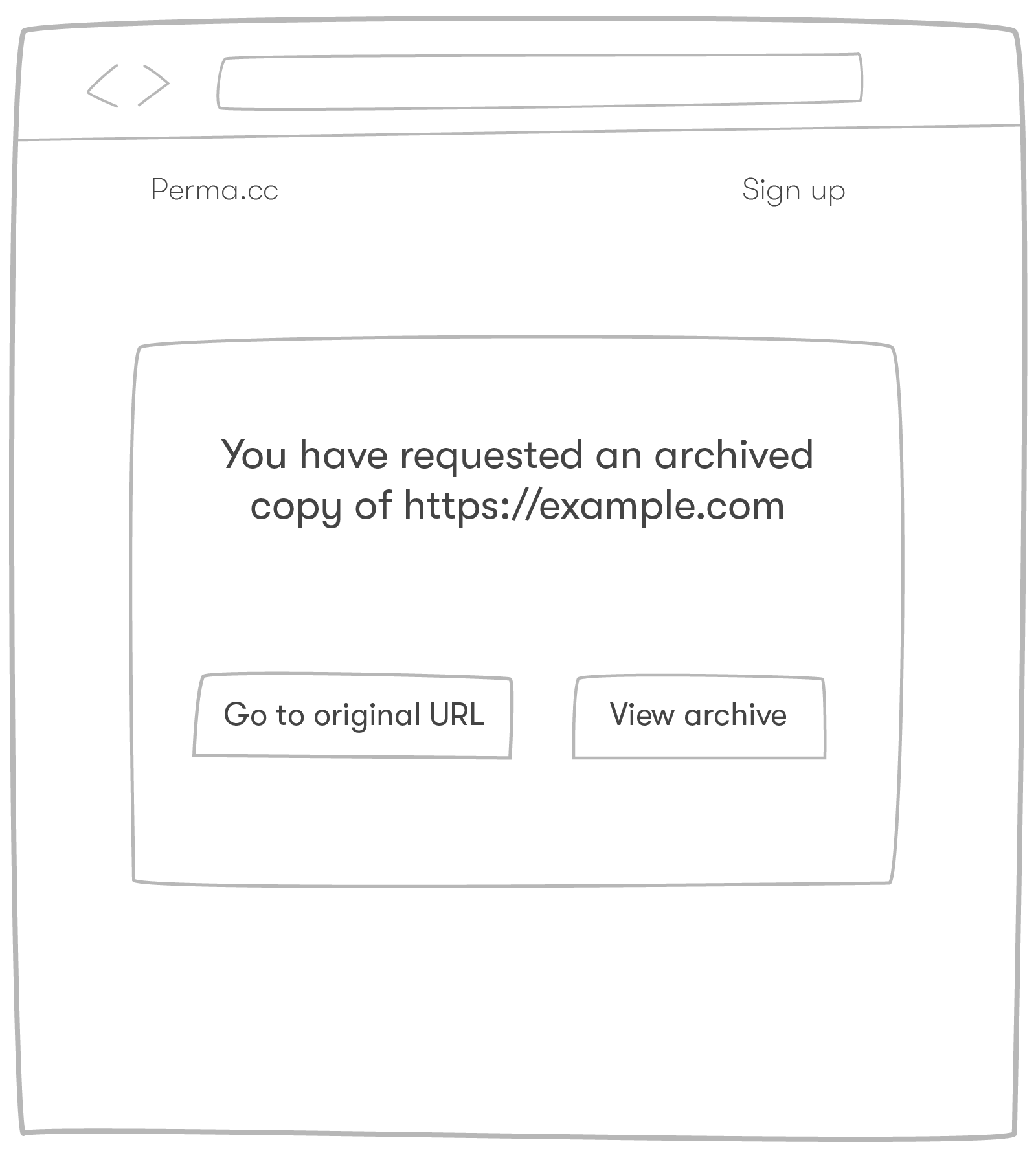
An interstitial approach we dropped at this step.
Step Five — Prototype and Hand Off
Output: interactive prototypes and feature documentation.
The goal in wrapping up is to support the next team’s handoff with detailed notes and clear callouts for the user requests that matter most. Keep the energy strong — last-minute opportunities surface here, and so do pitfalls.
A recording of the desired interaction. The product team uses high-fidelity prototypes like this as reference.
What Came Next
Once users could generate and view archives, they wanted to organize the pile of links they’d built. So another loop starts at step one — this time asking, “what admin interface best supports the user as they organize their archives?”
Role and Team
I was fortunate to build Perma with a team of eight: one visionary faculty lead, a project manager, a UI designer, a communications person, and three full-stack developers.
I played the roles of Interaction Designer, Full-Stack Developer, and Product Designer for this feature, and across the Perma team from 2013 to 2017. I led the process described above. The Perma.cc application is built on Python, Django, AWS, and JavaScript; wireframes and visual assets here were drawn in Balsamiq and Adobe Illustrator. Perma’s source is freely licensed on GitHub.
Role. Interaction Designer. Full-Stack Developer. Product Designer.